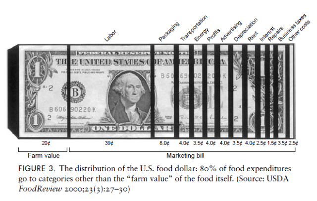
From Marion Nestle’s book on Food Politics:
Interesting graph, but undermined by its cuteness. Farm value and labor, the first two segments, make up just short of 60% of the total, but appear to be less than 50% (maybe even 40%) because of all the inserted black gaps. But maybe that’s by design, to make the relatively small advertising and transport costs seem bigger?

Leave a reply to Terri Cancel reply